In life we don’t often get the chance at do-overs. How would things be different if I had the brain of today to solve yesterday’s challenge?
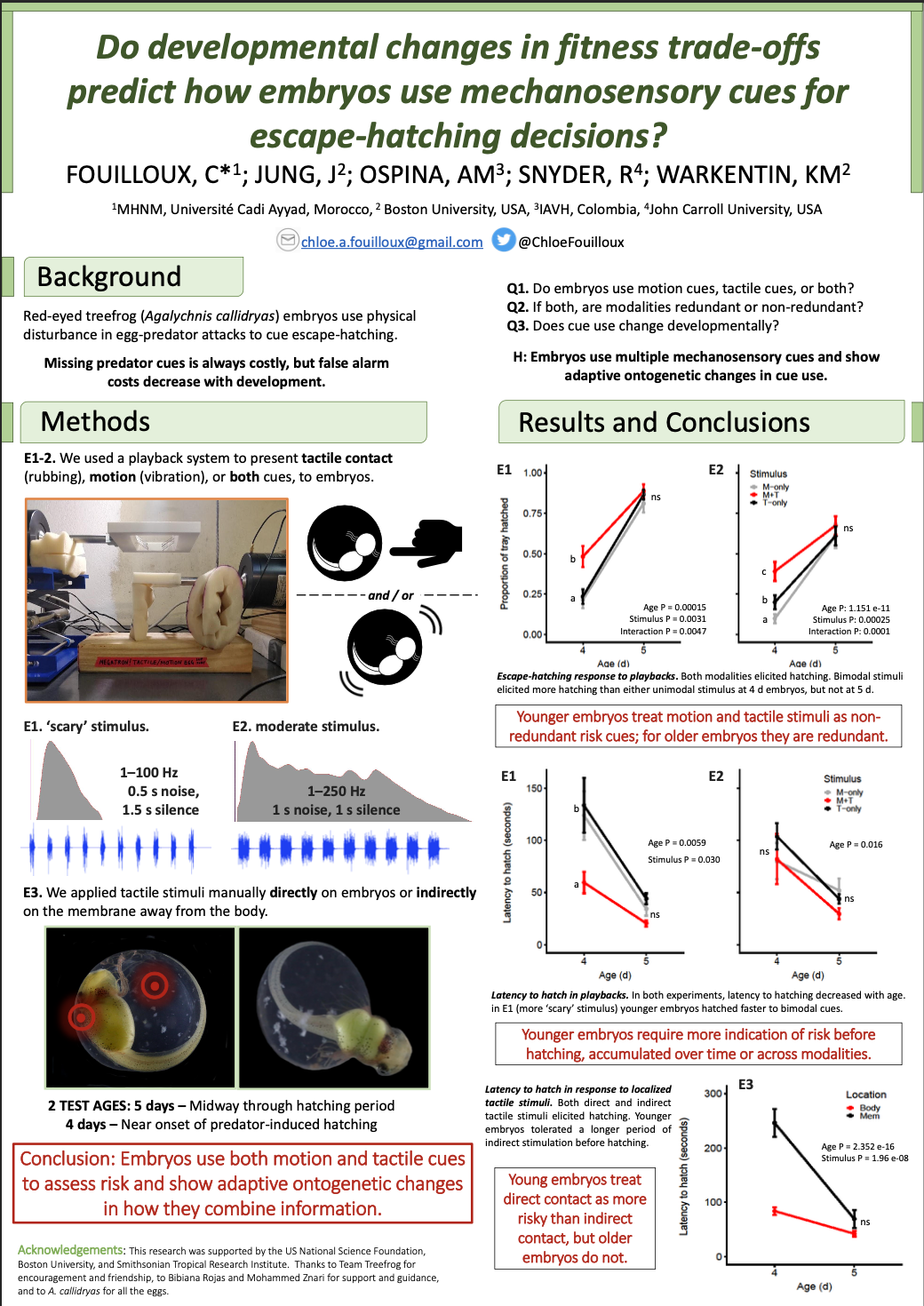
Well, I had the rare opportunity to do just that by being able to redesign a conference poster from my very first Ph.D conference in 2019 at ESEB in Turku, Finland. I had just barely started my program at the University of Jyväskylä and was presenting work I had done in Panamá with Karen Warkentin while living in Morocco working with Mohammed Znari. It was quite the time for a tadpole to be hatched into the big ol’ pond of science.
If you want to another example that more explicitly outlines design concepts, check out the work I did with Eldon’s poster redesign here.

So, what changed five years later? First, I restrict poster content to my golden 250-word limit. Make the threshold for engagement at low as possible: bold colours, bold images, bold. . . everything. I also aim to go for repetition in shape use by capturing the circle of the egg in the repetition of circles throughout the poster. Finally, I aim for a more consistent use of colour by limiting my palette for emphasis and narrative flow. If you find yourself really challenged by these constraints, make a QR-code as a kind of “supplementary materials”– if people really want to know what your set-up looked like, they’ll scan it. You can throw additional plots and references on there too.

So, take the leap! Dare yourself to look over your old work. Be kind to who you were and bathe in the warmth of how wonderfully far you’ve come. I can’t wait to see how I would shred all my previous work five years from now!

