To wrap up this semester I had the wonderful opportunity to design the logos for the Ecological Society of America Disease Ecology Section. I thought it would be fun to sketch out my process and what gave rise to each of these illustrations.


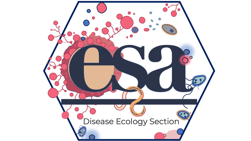
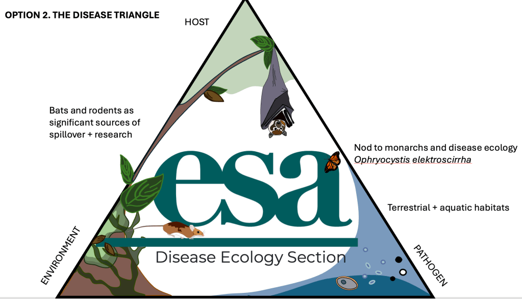
For this assignment I had total creative freedom, which is both exciting and a bit daunting. Disease ecology is such a rich and diverse body of science, so where to begin? Equipped with the joy that only a blank sheet of paper fuels, I started by sketching the main ideas I wanted to explore: a nod to pathogen diversity (from bacteria to macroparasites), capturing the host perspective (spillover and major carriers), and bringing everything back to one of our beloved fundamentals, the disease triangle.
I like to begin on paper to see what emerges when I start putting marks down. At first I wanted to turn the “S” in ESA into a helminth, but I realized that modifying the ESA logo would compromise consistency with the overall brand used by other ESA sections. Once I let that go, I began searching for pathogen references. I knew I would return to my PhD roots and draw the terrible Batrachochytrium dendrobatidis (the pink form in the hex logo). I also attempted an illustration of Aspergillus fumigatus, a nasty fungus that causes serious problems for humans. I tried several versions but could not simplify the structure into a shape that felt right. Maybe it will appear in another project.


Once I had the basic forms down, I began developing the larger story I wanted to tell. For the hex logo I needed to calm down on the colours, so I generated a palette to keep everything consistent. I enjoyed arranging the pathogen shapes so they interacted in a way that felt playful while still reflecting the diversity I had imagined. The helminth hanging from the “S,” the little E. coli running around being their usual menaces, all of it pushed me toward something dynamic without becoming too caricature driven.
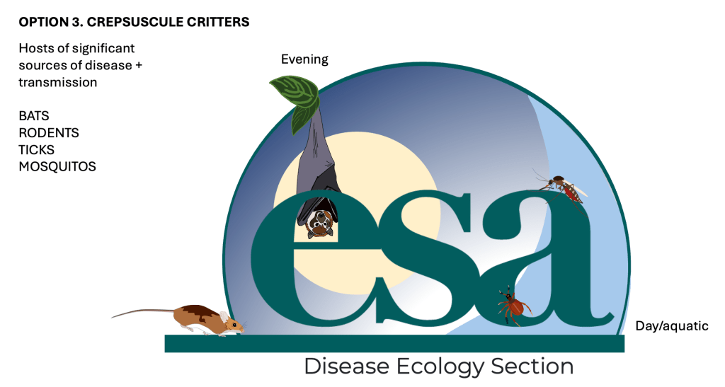
The disease triangle was a bit more straightforward. I wanted both terrestrial and aquatic habitats represented, and the overhanging tree naturally emerged as a bridge between these two worlds. For the final logo I wanted to experiment more directly with form. The hexagon and triangle gave me strong scaffolds, but I wanted one illustration that came only from my head. I kept coming back to the fruit bat sketch and thought it would be fun to have the little guy peeking out of the logo. Since that added quite a bit of visual complexity, I used the moon to create contrast and to anchor the composition. That decision made me think about the sky and the importance of timing in infection processes, both from circadian perspectives and vector activity. That is where the semi-circle background came from. And of course nothing felt complete without the most adorable little mouse running in to join the commotion.

If you are coming to the upcoming ESA conference in Salt Lake City, UT (July 26 to 31), please come by and vote for your favourite logo. It will represent the Disease Ecology Section for the next calendar year. I would also love to know which one you think is the coolest, so feel free to cast your vote below.
If you are coming to the upcoming ESA conference in Salt Lake City, UT (July 26-31) [https://esa.org/saltlake2026/] please come around and vote for your favourite logo which will represent the Disease Ecology Section for the next calendar year. I’d also love to know which one you think is the coolest: cast your vote below!